top of page

Client
La Poutine
Scope
-
Branding
-
Business Cards
-
Labelling
-
Apparel
Overview
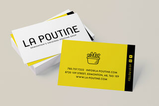
La Poutine is a staple in Edmonton and is known for bringing Montreal-style poutine (complete with squeaky curds) to the city. The previous branding was challenging to use as it was a multicolour cartoon style, and it wasn't always clear from a distance what the icon was. The team at La Poutine wanted something simple and easy to read that captured the modern take on the poutine that La Poutine was offering. The final brand system features a versatile logo that can adapt to any application and looks like it was created to be lit up in lights and beckon hungry poutine fans to their door.
bottom of page


